A New Vision for Univision
Univision originally launched its first OTT app in 2015 as a Youtube-like video viewing app available for mobile, tablet and desktop but it was lacking from a user, business and branding perspective. Consumers and Univision deserved and needed a premium experience.
Original Landing/Sign-Up Page
The original landing page was lacking style and visual cohesiveness.
Original Plan Selection
Better clarity of actionable items but still not very engaging.
Original Landing Screen
Fairly consistent with OTT UX patterns but still lacking in style and usability.
Original Channel Selection Screen
Youtube-like video view and channel selection screen make experience feel less like SVOD, again reinforcing lack of value.
Local News Screen
Screen pulls in local news page from Univision.com. While of interest, this creates a confusing and disparate experience. Univision already contained a full suite of apps geared toward local news markets.
Interim Landing and Styles
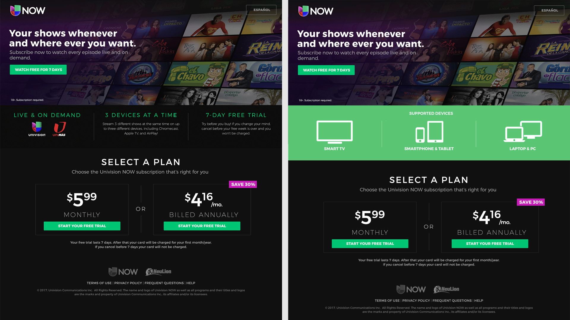
Working with product and our vendor I helped refine the new UI and templates and developed comps to replace the existing landing page. As this process moved along it helped evolve the marketing and UI styles.
Interim Landing Page
Using the existing palette, I created comps that would combine the plan selection and marketing messaging to one single page, thereby reducing barrier to entry and creating a clearer
V2 Interim Comps
The comps shifted with the desire to have a dark UI consistent with industry standards. We maintained the green from the exiting palette as it helped create actionable buttons, links and accents. This along with the font Montserrat created the basis of our UI and styles moving forward.
Header Image Explorations
I experimented with various header explorations where we could mask off photos or key art using the Univision “tulip” allowing for marketing and promo messaging to be prominently displayed.
Bringing It All Together
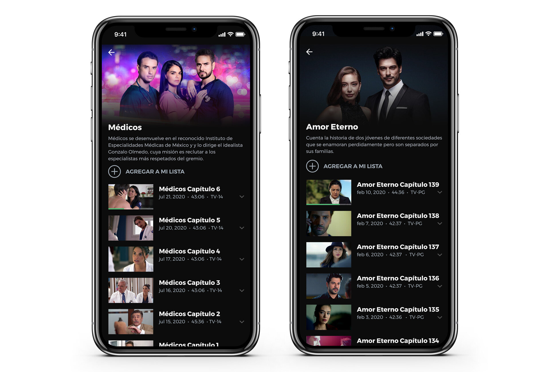
After many sprints, design tweaks and QA, Univision was finally able to launch an OTT product that was worthy of the largest provider of Spanish-language content in the United States. Consumers of Univision’s vast offering of novelas, classic series and live soccer finally had the experience they deserved.
Two Apps, One Experience
With Univision Now (OTT) and Univision App (TVE) users share the same experience but come from two different consumer starting points.
Univision Now originally launched as a D2C app with TVE authentication available but for business reasons needed to be split, spinning off into a separate TVE version, Univision App. Both experiences are identical to consumers, but content can programmed independently of one another using a shared CMS.
New Experience, New Branding
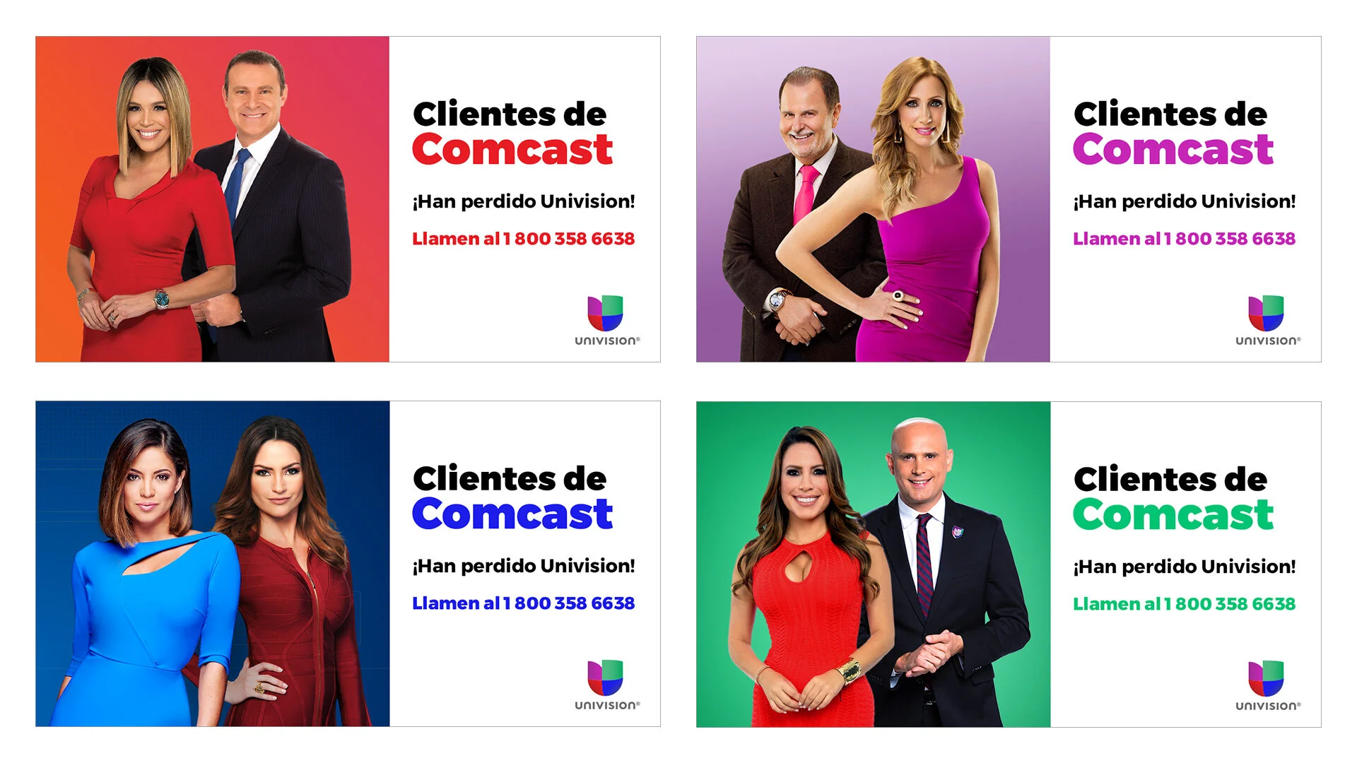
New branding was introduced for marketing, social and other elements to create unified branding around Univision’s varied content offering.
The Univision “Tulip” was utilized with a prism effect to reinforce the connection to the overall parent brand. The muted color palette and clean san-serif font for the app serve as a contrast to highlight vibrant artwork and photography and serve as the basis for all social and marketing materials. Our team won the bronze at the 2018 PromaxBDA Awards for the relaunch campaign around Univision Now.
Apple App Store Artwork
In-App Message Examples


